Something a little funny.
Being a hopeless nerd, I have MP3s of NES tracks on my iPod. This ranges from the puzzler classic Solstice to the action/adventure Guardian Legend. Since I’m obsessive-compulsive about music, I have sorted most of these tracks into albums, placeholders for the game they’re from. And because I enjoy looking at shiny things, I have crafted (from screenshots, box art, etc) “album” covers for several of these games so they show up on said iPod.
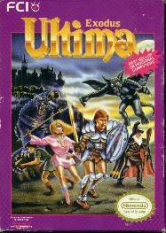
I was looking to create such for a couple Ultima: Exodus tracks yesterday and wasn’t having much luck finding a decent-sized picture of the box art. Here’s the best I could find:

Not too bad, but if you trim it so, say, it doesn’t have the Nintendo seal or the crinkly bits on the sides, the quality isn’t great.
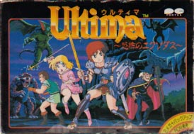
On the third or fourth page, though, I found the following:

At first, I didn’t think much of this. I mean, it’s a pretty cool picture, but then so is the US box art. Hey, wait a second… the US box art…
Take another look at the US art. The art for these two games has the exact same situation, with a distinctly different style. Take the wizard, off to the right; in both pictures, he’s wearing a black cloak, has the same pointy hat and staff, and he’s facing the same direction. The warriors in both pictures are wielding the same weaponry; same with the priestess and the monk. Even the monsters they’re fighting are remarkably similar.
I can’t be the only person who finds this hilarious. Granted, Ultima is a western RPG, but the US version of the NES port came out over a year after the Japan version did; so someone probably looked at the box art and thought it was a good design, but just wouldn’t sell; we needed grittier presentation and more rubbery-looking monsters. This isn’t the only game it’s happened to, but this is among the most obvious I’ve seen.
Also, Ultima: Exodus is a pretty cool game.
lys Said,
June 10, 2008 @ 1:33 pm
FCI haha…guess they wanted it to look less cartoony for the North American’s. I’ll admit, I prefer the US one. The japanese one…looks like it’s from a JRPG.